If you’ve missed my other posts, I’ve done ~1~ & ~2~
So, how does it get from my head to paper?

Once I’ve picked the verse or passage, I write it out… just scratch it quickly.
Then I study it-what word emphasis do I think would benefit the observer? Do I want a glance to show all the “THE”s? Probably not 🙂
I usually emphasis any name of God as well as any of His attributes being conveyed {Place of Refuge}.
Then I grab some paper.
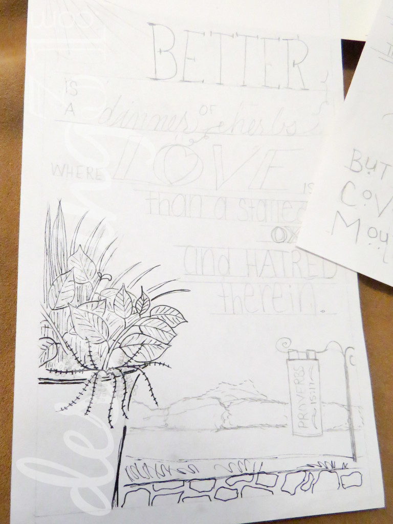
For my initial sketches I use scrap printer paper… for my “good drawings” [after I’ve practiced a few times, trying different layouts and maybe even different fonts], I use a very inexpensive notebook of sketch paper from walmart. It was, I think, around $3 for 70 pages.
I also use a ruler to create lines to help keep my words straight across. they get erased after I pen over the words, embellishments, and picture.
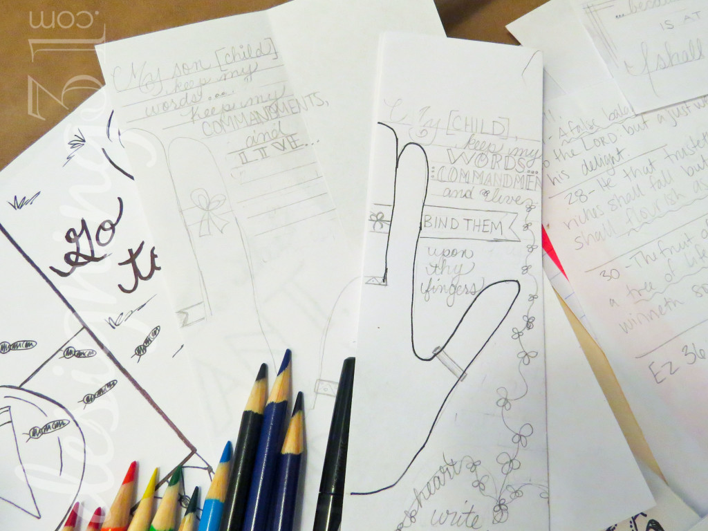
Sometimes I begin with placing my picture first. But just as often I sketch out the word placement and then try to put embellishments or a drawing in the space that is left. There is not “right or wrong” way to do this. It’s supposed to be personal.
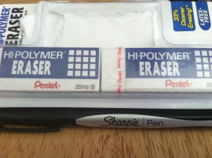 I use a regular pencil, with a light hand–that’s key because you will probably need to erase more than once. The eraser has become a good friend! I use a latex-free, high-polymer from Pentel. It’s REALLy good at erasing, and not that expensive. I’d say it is worth the few extra pennies.
Then I trace over the pencil marks that are part of my design [not the guide marks 🙂 ].
For tracing over the pencil marks, I use a Sharpie Pen {not a fine-tip marker, but the pen}. You can faintly see it on the other side of the fine Bible pages, like most pens; but it does not bleed through. And it creates very thin, sharp lines. I love it. Many Bible journalers recommend Micron pens. I’d like to try them sometime, but I haven’t yet.
Then I erase the pencil marks {with my new friend :)} and color it.
I use just plain Crayola Colored Pencils. [I also bought some of the Dollar Tree pencils for the kids to use-as they break and loose them very quickly…. but I do not personally enjoy how they color.]
And I’ve learned that non-colored space can be friendly, too!
Here I was inspired by a friend…
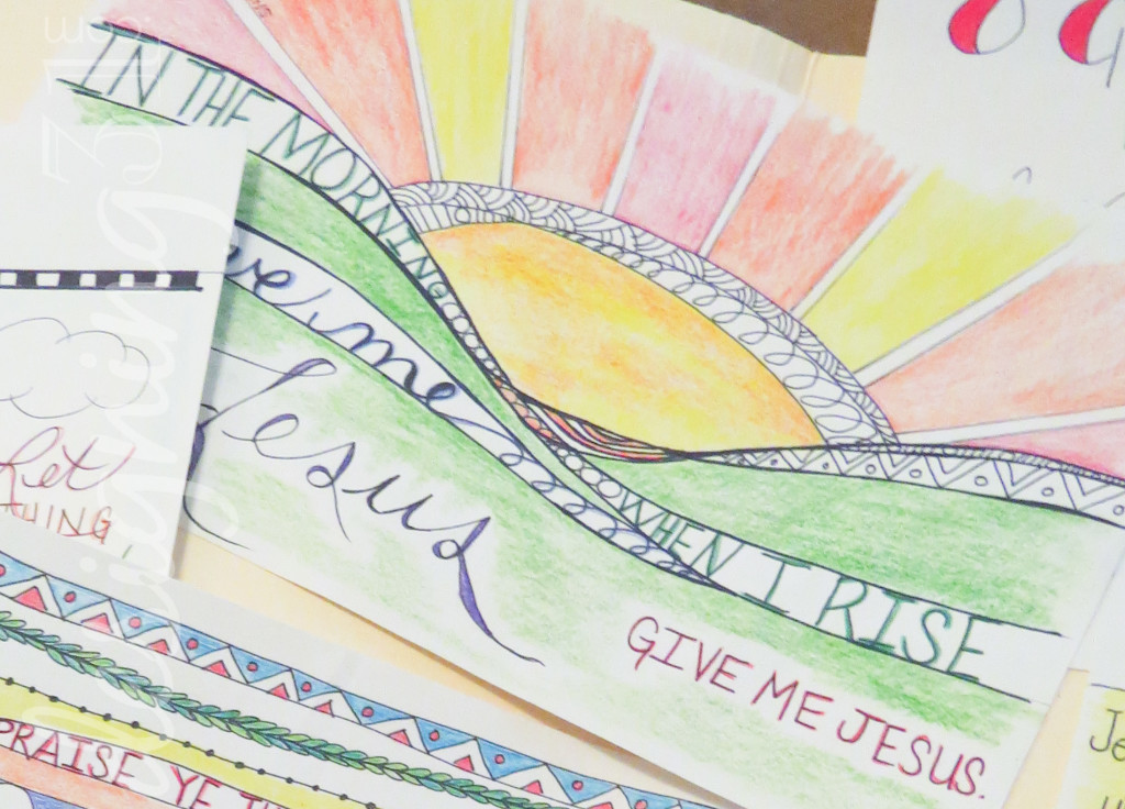
and the words of the song by J. Camp kept running through my head… so I did this:
Just some curvy lines for the hills… a partial circle that is very imperfect for the sun. I did use a ruler to create straight lines for the rays. I found inspiration for the sun from Joanne Fink, of Zenspirations.
And I also redid this one:
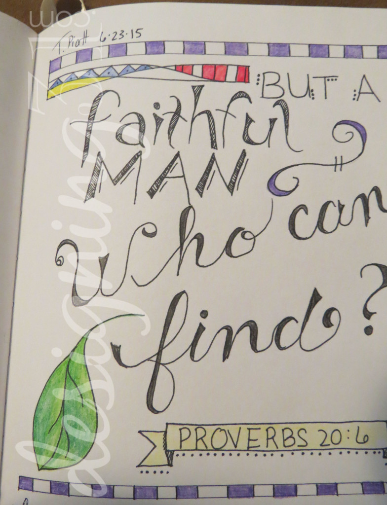 There is truly such a community of journalers out there now, that I love to draw inspiration from others.
I look up drawings of things I want to use to illustrate a thought… like a well. And then I try to replicate it-in my own way. When I look through other journaler’s art, I study the lines that make the pictures and words.
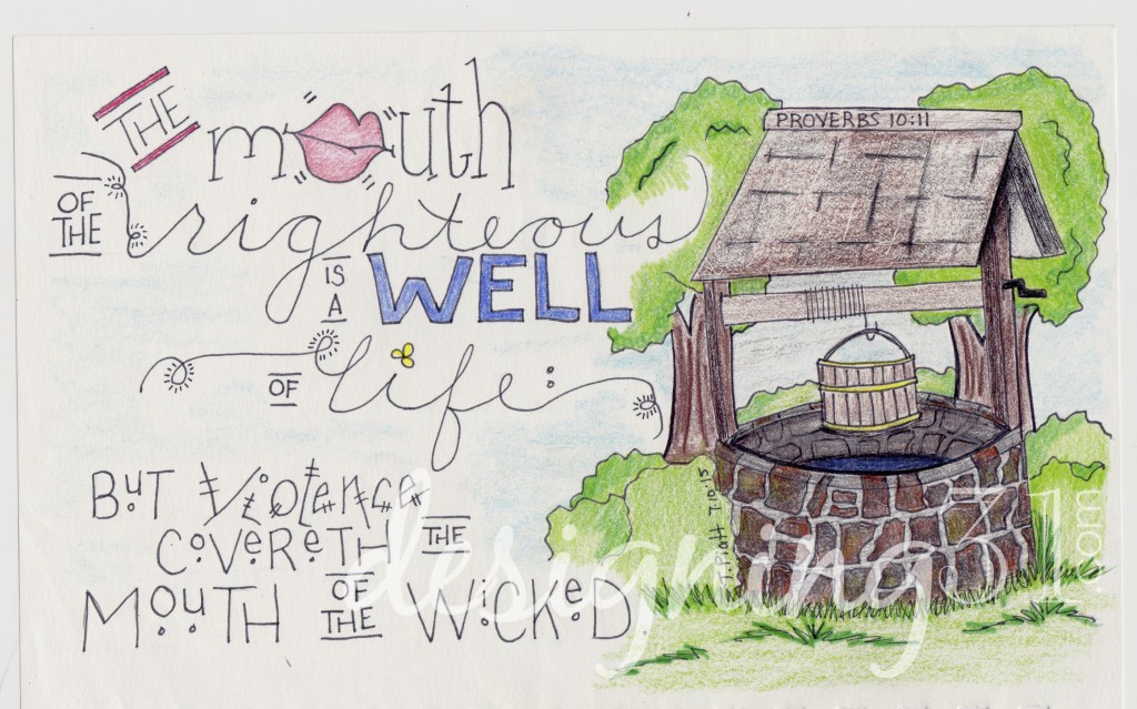
Proverbs 10:11
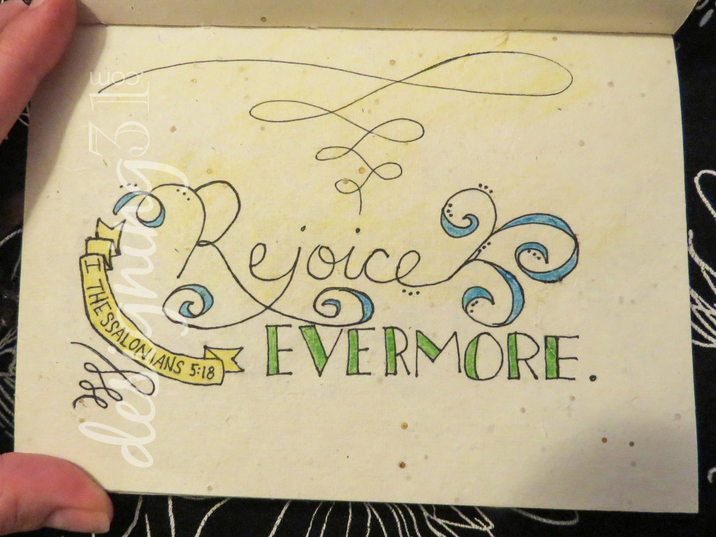
Banners and swirls are a simple way to add interest. Here’s a great video tutorial on simple banners.
So… Next I’ll talk about letters and fonts.
here’s post by Time-Warp Wife about some lettering.


